
Computer Monitors In-Depth
A few months ago, I finally got my first MacBook. I’d been wanting one for a while, especially for my coding projects and university. When I first plugged it into my external monitor, however, I was a bit shocked. The image looked blurry, and the crisp look I was used to from my MacBook screen turned into a pixelated mess.
So I decided to dig into why that was the case. The answer to that problem was quite simple: macOS is designed for HiDPI and high-resolution Retina displays (don’t worry if you don’t know what that means yet, we’ll cover it later, when we talk about scaling). Using it on a standard FHD monitor just doesn’t cut it.
When I decided to look for a new monitor, I was quickly overwhelmed by the sheer number of specs to consider. But to my surprise, I found the topic fascinating, so I decided to dive deep. I realized I might want to look up these details later, and figured this information could be beneficial for others as well—so I decided to compile everything in this post.
Note: This post turned out to be really long. However, since I didn’t want to make just another generic “buying guide,” but rather provide a real understanding of how monitors work, I decided not to cut out any technical details. If you are just interested in a general list of recommendations without the deeper explanations, feel free to jump straight to the conclusion.
1. The Basics
Let’s start with the fundamentals. You’ve likely heard terms like resolution or refresh rate before, but they are more than just buzzwords on a box. Luckily, these specs are fairly easy to understand, but absolutely critical for filtering out the wrong monitors right from the start.
Size and Ergonomics
Just to be clear: when we talk about monitor size, we are always referring to the diagonal length of the screen (e.g., from the bottom-left to the top-right corner). While size is largely a matter of personal preference, finding the right fit for you is about balancing screen space with ergonomics.
Here’s a breakdown of the most common sizes:
- 24-inch: This used to be the office standard, but for most modern workspaces, it can feel cramped. Once you open two programs side-to-side, you run out of space quickly.
- 27-inch: For most people, this is the perfect balance. It’s wide enough to comfortably have two full-sized windows side-by-side without forcing you to constantly rotate your neck.
- 32-inch: Very immersive, but requires a deep desk. If you sit too close, the edges of the screen might fade out of your peripheral vision.
Any monitor with a screen size greater than 34 inches is generally considered an ultrawide monitor. They are a great choice if you dislike multi-monitor setups but still want plenty of screen space. However, bear in mind one major downside for remote working: Screen sharing. Sharing your full ultrawide screen with a colleague using, for example, a standard laptop results in them seeing only a tiny, unreadable letterbox strip.
Aspect Ratio
While size tells you how big the screen is diagonally, the aspect ratio describes the shape of the screen (width vs. height). Depending on what you do with your computer, the shape can be just as important as the size. I’ll cover the most common ones here, though keep in mind that other niche formats do exist.
- 16:9: The standard format for almost every TV and most external monitors. Since most video content (YouTube, Netflix, Games) is produced in 16:9, this format fills the whole screen without black bars.
- 16:10: Many modern laptops (especially MacBooks) use this slightly taller aspect ratio. It gives you a bit more vertical space, which is beneficial for reading or coding because you can see more lines of text before you need to scroll. However, external monitors with this ratio are relatively uncommon and often more expensive.
- 21:9: The standard for ultrawide monitors. These screens offer immense horizontal space, making them ideal for replacing a dual-monitor setup or for immersive gaming. Just be aware that watching standard 16:9 video will result in black bars on the sides.
However, in most cases I’d rather choose the monitor by size and resolution (which we’ll cover about in a bit) instead of looking for a specific aspect ratio.
Refresh Rate
The refresh rate describes how often the image on your monitor is updated per second. It is measured in Hertz (Hz) with 1 Hz meaning one image update per second.
While this spec is more important towards gamers, it also affects how fluid your mouse movement and scrolling feel during work. Therefore, you might consider it for your work monitor as well, as long as it fits your budget.
Generally, there are two categories of refresh rate:
- Standard (60 Hz): This means the screen updates 60 times per second. For decades, this has been the gold standard. For coding, browsing, and watching videos, 60 Hz is perfectly fine and comfortable. However, coming from a gaming background, it might feel slightly less responsive.
- High Refresh Rate (120+ Hz): Common in gaming monitors, but now also standard on high-end devices like the MacBook Pro (Apple calls this ProMotion) or many other higher-priced laptops. While not strictly necessary for office work, it makes scrolling through long files or moving windows feel incredibly fluid. Once you get used to it, it can be hard to go back, though I would consider it a luxury rather than a necessity. Also, especially when combined with a high resolution, monitors with higher refresh rates are often quite expensive.
Resolution
The resolution refers to the number of pixels displayed on the screen. It is usually written as width x height or abbreviated as height + “p”. Generally speaking: The more pixels you have (without changing the screen size), the sharper the image.
There are three common resolutions that you will likely find when looking for a new monitor:
- 1920x1080 (Full HD / FHD / 1080p): This was the gold standard for years. On a small laptop screen (13-15 inches), this looks fine, but on bigger screens, everything gets pixelated, especially if you are using macOS.
- 2560x1440 (QHD / 1440p / 2K): The sweet spot resolution for 27-inch screens nowadays, especially for Windows users. It gives you way more screen space than FHD and a sharper looking image.
- 3840x2160 (UHD / 4K): This resolution gives you a very sharp image. The pixel density (which we talk about two sections ahead) is usually so high that interface elements (text, buttons) appear tiny on a 27-inch monitor without scaling.
2. Advanced Fundamentals
Now that we have covered the absolute basics, let’s dive a bit deeper. In this section, we will cover two important topics that are often misunderstood: scaling and pixel density.
Scaling
If you run a 4K monitor at 100% scaling (meaning one physical pixel displays exactly one pixel of the image), interface elements will be tiny. That is where scaling comes in. However, the way scaling works differs drastically depending on your operating system. Due to personal interest, I will cover how macOS handles resolution here, mainly to explain the struggles I mentioned in the introduction of this post.
MacOS uses a system that relies on integer scaling. Essentially, macOS distinguishes between three resolution modes: LoDPI, HiDPI, and Fractional (in-between).
LoDPI
When using a LoDPI mode, macOS doesn’t do any scaling at software level. It maps the pixels of the image 1:1 to the resolution and sends that signal to the monitor.
For example, when you select a resolution of 1920x1080 (LoDPI) on a 4K monitor, the image passed to the monitor is only 1920x1080 pixels large. To fit this image onto the full 4K screen, the monitor’s hardware has to stretch the image (upscaling), which often results in a blurry or pixelated look.
HiDPI (Retina)
On the other side, macOS has a HiDPI or Retina mode. In this mode, macOS renders the interface at 2x the target resolution so that the resulting image matches the physical pixels of the screen perfectly.
For example, if you want your 4K monitor to “look like” 1080p (in terms of UI size), you can select 1920x1080 (HiDPI) in the display settings. Then, macOS keeps the logical resolution of 1080p but renders it at 3840x2160 pixels. Therefore, the resulting image matches the monitor’s native 4K resolution perfectly, resulting in incredibly sharp text.
Fractional Scaling (In-Between)
In the middle, things get a bit messier. Let’s say you want a logical resolution of 2560x1440 on a 4K screen (roughly 1.5x scaling). Here, upscaling to 2x the logical resolution is too big to directly display it pixel-perfect on the monitor. However, macOS does this 2x upscaling anyway and renders a massive 5K internal image (5120x2880). It then scales that 5K image down to fit the 3840x2160 pixels of the 4K display. This downscaling process requires more GPU power (which shouldn’t be noticeable on modern Apple Silicon devices, in most cases) and can occasionally introduce a slightly softer look compared to native HiDPI.
Pixel Density (PPI)
Another important metric, especially when it comes to monitors for Mac-usage, is Pixel Density. It is usually measured in PPI (Pixels Per Inch) and it’s exactly what it sounds like: a count of how many distinct pixels fit into one inch of your screen. It is actually quite simple to calculate:
where w and h are width and height (in pixels), respectively, and d is the screen size (in inches). Therefore, if we take a 27-inch 4K screen as example, the pixel density would be:
A low PPI means that you can easily distinguish individual pixels. On displays with a high PPI, the pixels are so small that they vanish to the human eye, and text looks like it was printed on paper.
Now you may ask, what pixel density is considered “low” and what is considered “high”. For reference, Apple’s Retina displays aim for a very high pixel density, mostly between 218 and 254 PPI. Generally, however, we can categorize pixel densities into four groups:
- Low Density ( 96 PPI): Text looks blocky and circles have visible “steps” (aliasing). A standard 27-inch FHD monitor (~82 PPI) falls into this category. This density is acceptable for gaming, as motion blur tends to hide the lack of detail anyway, but for any work-related tasks, it should be avoided.
- Standard Density (100 - 110 PPI): This offers a decent experience. From a normal viewing distance, text looks clear enough, though pixels are visible if you lean towards the screen. Windows and Linux work perfectly in this range. However, because macOS is designed for Retina displays with high pixel densities, this range should be avoided for Mac users, as the interface will look slightly blurry or soft. A 27-inch QHD monitor (~109 PPI) falls into this range.
- High Density (135 - 165 PPI): In this range, it is hard to see individual pixels and text looks incredibly smooth. Windows and Linux look very sharp here. Even macOS looks great in this tier, though it isn’t quite as sharp as a native Retina display. Both 27-inch 4K (~163 PPI) and 32-inch 4K (~138 PPI) monitors fall into this range.
- Retina Displays ( 200 PPI): These were developed by Apple with the goal of making pixels invisible, creating a “print-like” quality. For macOS, this is the absolute best viewing experience. A few years ago, the only way to achieve this density would be to buy the 27-inch 5K Apple Studio display or the 32-inch 6K Apple Pro Display XDR (both ~218 PPI) for incredibly high prices. However, in recent years, many other manufactures have entered the market of 27-inch 5K displays so that you now have the option to choose from many other displays.
3. Panels
A display panel is the physical component of a monitor that produces the image you see. Monitors come with different kinds of display panels, each with their own unique pros and cons. I’ll go over the most common types here, explain how they work and what you should consider when choosing the panel architecture you want in your monitor.
Backlit Panels (LCDs)
Display panels generally fall into two categories. The first is backlit panels, also known as transmissive displays. As the name suggests, a light source (the backlight) shines through individual pixels to create an image. In the consumer electronics market, practically all backlit panels are Liquid Crystal Displays (LCDs).
Fundamental Structure
Before discussing specific panel types, it is important to understand the fundamental architecture of an LCD. Conceptually, an LCD is a “sandwich” of multiple layers:
- The Backlight unit
- The Rear Polarizer (Horizontal)
- The Liquid Crystal Layer
- The Color Filter
- The Front Polarizer (Vertical)

The Backlight
Before we talk about how the image is displayed, a quick word about the backlight. Traditionally, monitors used fluorescent tubes. While these are still found in older monitors, modern displays almost exclusively utilize LEDs and are often marketed as “LED monitors.” However, it is important to note that technically, they remain LCD monitors; they simply use a different light source.
Nowadays, the most common light source in LCD monitors is the so-called W-LED (white LED), specifically the “edge-lit LED”. Monitors utilizing this backlight have just one or two LED stripes aligned along the edge of the screen, and a light-guiding plate that distributes the light across the backplate.
The main downside of this approach is that achieving uniform light distribution across the screen is difficult. Also, monitors with edge-lit backlights may suffer from “backlight bleeding”, meaning the corners appear much brighter than the rest of the screen due to light leaking through them.
A better alternative to an edge-lit backlight is a direct-lit one, in which around 50–100 LED strips point directly towards the rear polarizer. The downside of this approach is the higher production cost, and the monitor also needs to be slightly thicker to give the LED strips the space they need.
The third and best type of backlight is the Mini-LED (not to be confused with Micro LED, a panel type that we’ll cover later). As the name suggests, Mini-LED backlights use multiple smaller LEDs that can be dimmed or brightened individually. A monitor with this type of backlight can analyze the picture 60-144 times per second. If there are areas that are completely black, the backlight LED in this section can be deactivated, allowing for a true black. Similarly, if there is an area with very intense colors, the backlight LED brightness can be boosted to the maximum in this area. However, this can introduce “blooming” or “glow”. For example, if an area with intense colors is only 100x100 px tall but the Mini-LED in the backlight covers 500x500 px, the brightness of the surrounding pixels will also be boosted, making whatever is displayed there appear more vibrant than intended.
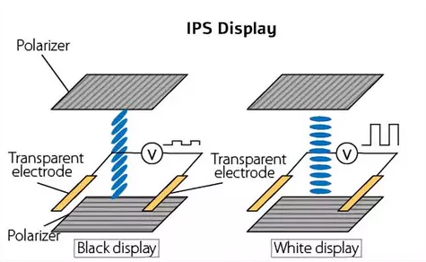
The Polarizers
The process of displaying an image begins with light emitted by the backlight hitting the polarizers (or, to be more specific, the rear polarizer). Think of these as gates: the rear polarizer admits only horizontally vibrating light waves, while the front polarizer admits only vertically vibrating waves. Without an intervening layer to manipulate the light, the second polarizer would block everything, resulting in a black screen.
This is where the liquid crystal layer comes in. It functions as the control mechanism and modulates the amount of light reaching the viewer by twisting the light waves, allowing them to align with the front polarizer and pass through. The precise method of twisting depends on the specific panel technology, which we will cover shortly.
However, regulating light intensity is only half the battle; we also need color. If we simply allowed white light to pass through, the screen would just display a white image, which is not what we want. To display an actual image, the screen needs to be divided into individual segments called pixels.
Each pixel is composed of three subpixels, each with a dedicated color filter: Red, Green, and Blue. These subpixels are controlled individually. In a standard 8-bit display, each subpixel has 256 (2^8) opacity levels (0 blocks light entirely, while 255 allows full transmission). Because these subpixels are too small for the human eye to resolve individually, our eyes blend the red, green, and blue intensities together, interpreting them as a single, specific color.
Twisted Nematic (TN)
How does it work?
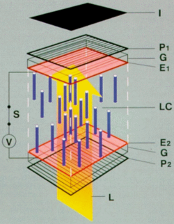
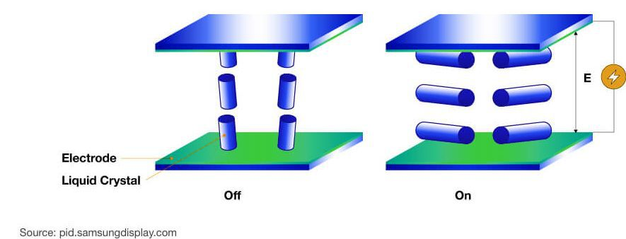
The oldest and most established LCD technology is the Twisted Nematic (TN) panel. In its natural state (when no voltage is applied), the liquid crystals form a helix structure. This helix twists the backlight’s polarization by 90 degrees, allowing it to slip through the second polarizer and light up the screen.
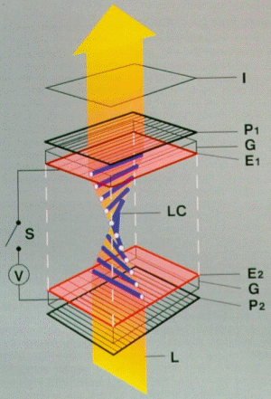
When voltage is applied via electrodes, the liquid crystals untwist and straighten out. This destroys the helix structure, stopping the light from rotating. Therefore, the light is blocked by the vertical front polarizer, darkening the (sub)pixels.
Up- and Downsides
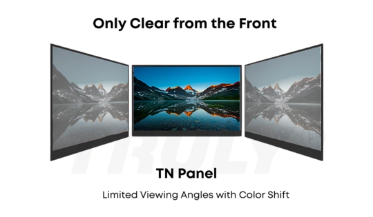
While the primary benefit of TN technology is its rapid response time (allowing for high refresh rates with minimal motion blur), meaning the time it takes for the monitor to respond to a new input signal from the computer, and the cheap production cost, there are two significant downsides: poor viewing angles and bad color representation.
Because of the way the crystals are aligned, viewing the screen from the side or below causes the light to refract differently. This results in “gamma shift”, where colors appear darkened or inverted if you are not seated directly in front of the center of the screen.
Conclusion
Although displays with TN panels still exist, they have become significantly rarer in recent years, appearing mainly in high-end competitive gaming monitors (due to their fast response times and high refresh rates). TN panels are mainly used in ultra-budget monitors or in highly competitive environments, as professional eSports players do not care about accurate colors but mainly about reaction times and low latency, which is where TN panels really shine.
Vertical Alignment (VA)
How does it work?
Vertical Alignment (VA) panels were designed to address the major issues with TN panels. The liquid crystal layers work in a similar way to TN panels, but instead of using a helix structure, VA panels arrange the liquid crystals vertically when no voltage is applied. This means that the liquid crystals stand by default and, as soon as voltage is applied, they shift into a horizontal position, lying down and allowing light to pass through them.
Up- and Downsides
This panel type has two advantages: the color representation is much more accurate than that of TN panels, and the production cost is still reasonable. They are often used in curved gaming monitors due to their low production cost and ease of bending. VA panels really shine when it comes to a high contrast ratio. We’ll discuss what a contrast ratio is in a later section, but generally speaking, the higher the contrast ratio, the better the display’s dark colors. Specifically, VA panels produce the deepest blacks of all LCD panel types.
However, VA panels have one drawback: their response times are usually slower than those of TN or IPS panels, which we will discuss shortly. This results in a phenomenon known as “smearing” (see the image below).
Also, like TN panels, VA panels still suffer from gamma shift at certain viewing angles, but to a lesser extent.
In-Plane Switching (IPS)
How does it work?
In-plane Switching (IPS) panels solve the color inaccuracy and poor viewing angles issues of TN and VA panels. IPS panels achieve this with a unique approach. Instead of “untwisting” the liquid crystals (like TN panels) or allowing them to tilt and “fall down” (like VA panels), the liquid crystals lie flat, parallel to the screen glass. When voltage is applied, the crystals simply rotate in-plane.
Since the liquid crystals lie flat, the “long side” of the crystal is visible from any viewing angle. IPS panels usually have a viewing angle of 178°, which covers almost the entire area in front of the screen. This allows light to pass through consistently, resulting in stable, accurate colors.
What are the up- and downsides?
Compared to TN and VA panels, IPS panels offer significantly wider viewing angles. This means you can look at the screen from the side without the image darkening or colors shifting. They also generally provide better color accuracy and cover a wider color range. While historically slower, modern IPS panels now also allow for low response times and high refresh rates suitable for gaming.
However, there are two major downsides. First, their contrast ratio is generally lower than that of VA panels, meaning blacks often appear as dark gray (sometimes referred to as “IPS Glow”). Second, IPS panels are typically more expensive to manufacture than TN or standard VA panels.
Self-Emissive Panels
All of the panels I’ve mentioned so far rely on a backlight shining through a layer of liquid crystals that controls how much light comes through. However, there is a second category of panels that does not rely on a backlight. Instead, each pixel emits its own light, hence the name “self-emissive panels.”
Organic Light Emitting Diodes (OLED) Panels
The most common type of panel in this category is the OLED panel. As the name suggests, OLED panels consist of organic light sources that can be controlled individually. But let’s break it down slowly.
First, a quick review: A screen consists of pixels. A pixel is the smallest unit that can be controlled individually. Each pixel consists of three thin segments, or subpixels: one red, one green, and one blue. These subpixels can be lightened or dimmed individually. In a display with a bit depth of 8, each subpixel has 256 different brightness levels. By illuminating or dimming these subpixels, a pixel can display any color because the subpixels are so tiny that the human eye mixes the three colors into a single color. This concept is identical to how LCDs work, but the technical implementation differs.
How do organic LEDs work?
Organic light-emitting diodes (OLEDs) consist of organic compounds. An organic compound is essentially any chemical compound that contains carbon-hydrogen bonds.
The reason OLED screens do not use inorganic LEDs is simple: they are too large. Note: We are talking about standard surface-mounted LEDs here. When it comes to micro LEDs, size isn’t a problem anymore, but more on that later.
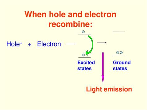
Generally, every LED’s light emission works conceptually the same. We use a semiconductor material and the process of recombination (filling electron holes with electrons), which emits photons once the applied energy is removed.
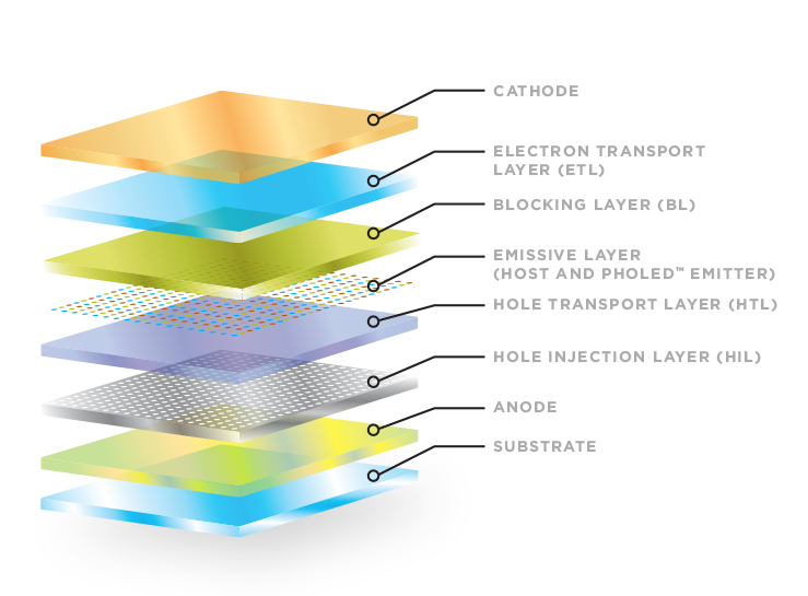
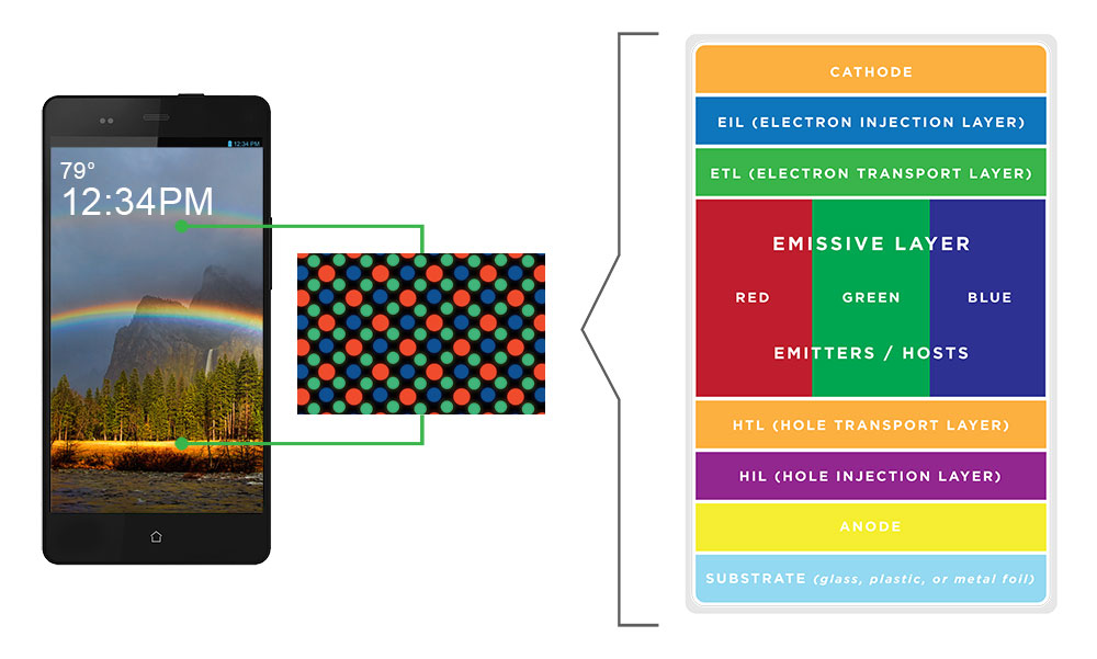
These layers are used to build an organic LED:
- Cathode
- Electron Transport Layer (ETL)
- Blocking Layer (BL)
- Emissive Layer
- Hole Transport Layer (HTL)
- Hole Injection Layer (HIL)
- Anode
- Substrate
Source: https://oled.com/oleds/
The core of an organic LED is the emissive layer. This is the layer where light is actually emitted. As previously mentioned, light is emitted when recombination occurs. In organic LEDs, we examine the energy levels of complex molecules (groups of atoms) rather than single atoms. By modifying these molecules, we can precisely adjust the color and efficiency of the light. In this layer, two key elements are distinguished: the host and the dopant.
The host makes up the vast majority of the layer, typically 90% to 95%. Consisting of molecules with a high energy gap, it acts as a storage unit that holds energy until it can be passed on. Its role is to serve as a transportation network, carrying electrons and holes across the layer.
The dopants are spread throughout the host. These molecules have a lower energy gap than the host molecules, which causes energy (or charge carriers) to naturally flow from the host to the dopant. Once energy is trapped in a dopant molecule, the molecule relaxes and releases the excess energy as a photon, or light wave. Dopants typically make up only 5% to 10% of the layer. If their concentration were higher, they would be too close together and start interacting with each other. This phenomenon is called concentration quenching, where the energy is lost as heat instead of being emitted as light.
To trigger the recombination process, we need to connect an external power source via two electrodes: a positively charged anode and a negatively charged cathode. At least one of these electrodes must be transparent; otherwise, the produced light would be blocked. This is achieved using indium tin oxide (ITO), a transparent, conductive material.
However, connecting the emissive layer directly to the electrodes isn’t efficient. There is a high energy barrier between the anode and the emissive layer, which makes it difficult for positive charges (“holes”) to enter. To address this issue, we introduce the Hole Injection Layer (HIL). Imagine the HIL as a staircase. Instead of one big wall, the HIL breaks the energy barrier into smaller, more manageable steps, allowing holes to climb up easily.
Next is the Hole Transport Layer (HTL). This layer uses high-mobility materials to efficiently transport holes to the center. The HTL also acts as an electron blocking layer, preventing electrons from “overshooting” and escaping the emissive layer through the bottom.
Similarly, there is a corresponding structure on the opposite side for negative charges (electrons). An electron injection layer (EIL) helps electrons enter from the cathode, and an electron transport layer (ETL) guides the electrons to the center while preventing holes from escaping.
Controlling The Pixels
Okay, now that we’ve had a fairly long introduction to how organic LEDs work, let’s talk about how we can use them to make a display panel. More specifically, how do we arrange and control millions of them on a screen?
In order to transform a single light source into a display, we must first arrange these organic light-emitting diodes (OLEDs) into a grid. In a standard OLED panel, each pixel on the screen is composed of three tiny organic LEDs sitting side-by-side: one red, one green, and one blue. These are called subpixels, as discussed previously.
However, there is a problem. A screen with Full HD resolution (1920 x 1080), for example, contains over two million pixels, meaning it has over six million individual subpixels. It’s impossible to run a separate wire to each one, as there is not enough space.
We use a method called a matrix to solve this. Rather than wiring each pixel individually, the screen is organized into horizontal rows and vertical columns. To turn on a pixel, the controller sends a signal to a specific column and row. The intersection of those two lines is the only place where the circuit closes and lights up that specific dot. This dramatically reduces the number of required connections.
Depending on how we control the grid, there are two implementations of this method: Passive Matrix (“PMOLED”) and Active Matrix (“AMOLED”).
The PMOLED technique is older and simpler. The controller scans the screen row by row, looking for the specified location. This happens so quickly—usually 60 times per second or more—that our eyes don’t perceive the scanning; we just see a steady image. The problem with PMOLED is that the pixels are off most of the time while the controller is busy with other rows. In order for the screen to appear bright to the human eye, the pixels must be driven with a high level of power for the brief moment they are active. This is inefficient and stressful for the organic material. Therefore, PMOLED is typically only used for small, simple displays, such as those found on fitness trackers or small text displays on appliances.
In an AMOLED panel, we add a base layer called the backplane, which is usually made of glass or plastic. This layer is covered in millions of microscopic transistors, or TFTs (thin film transistors).
You can think of these as giving every pixel its own switch and battery (capacitor). When the controller selects a row, it charges the capacitor at the specific pixel. Crucially, when the controller moves on to the next row, the capacitor holds the charge. This keeps the switch “open” and the pixel lit continuously until the next refresh cycle.
Since the pixel remains illuminated throughout, it doesn’t require an extreme power level. This allows for higher brightness, better energy efficiency, and a significantly longer lifespan. Therefore, this approach is used for most larger displays with OLED panels.
Creating Colors
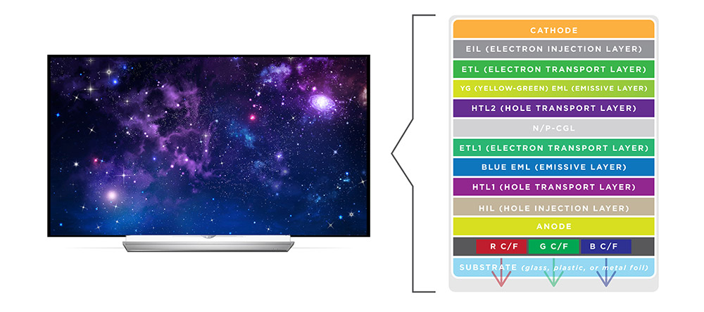
We know that every pixel is made of subpixels and that we can turn them on and off using AMOLED technology. But how are these colors actually manufactured? As it turns out, there isn’t just one way to build an OLED panel. Currently, three competing architectures exist, each with its own strengths.
The first is the RGB OLED architecture. It is the standard architecture used in almost all smartphones and smartwatches. In this method, the manufacturer places distinct red, green, and blue organic materials next to each other. The red subpixel contains red organic material, the green subpixel contains green organic material, and the blue subpixel contains blue organic material. This approach is primarily used for smartphones because scaling the tiny organic dots up to a large screen is difficult.
Source: https://oled.com/oleds/
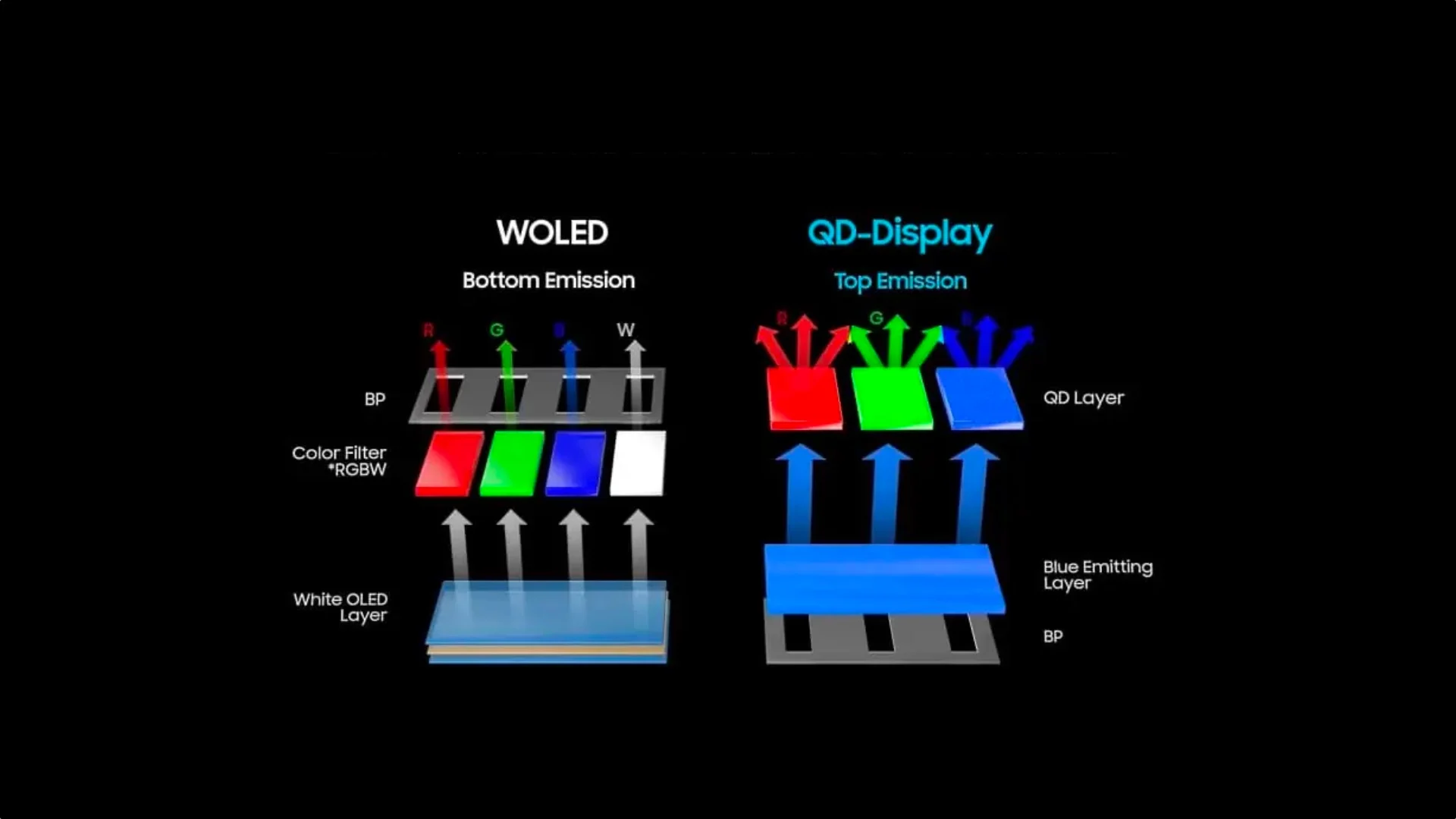
The second approach is the White OLED (WOLED) approach. To solve the manufacturing problem of RGB OLEDs for televisions, LG Display developed the WOLED architecture. Rather than laying down separate red, green, and blue strips, blue and yellow/red organic layers are stacked on top of each other across the entire panel. This combination creates a bright white light. To produce colors, we place a color filter (similar to those in LCDs) in front of the white pixels. Additionally, we typically add a fourth, unfiltered white subpixel (WRGB) to boost peak brightness because color filters also filter out some brightness. This approach is much easier to manufacture for large screens, which is why it is primarily used for televisions and computer monitors.
Source: https://oled.com/oleds/
The third and latest approach is the Quantum Dot OLED (QD-OLED) approach, primarily developed by Samsung. It aims to combine the strengths of the other two architectures. To do so, it uses a blue organic layer across the entire screen because blue is the strongest energy source. Additionally, rather than using passive color filters that block light, QD-OLED uses quantum dots printed on top of the blue pixels. Quantum dots are microscopic particles that absorb light and re-emit it as a different color with high efficiency. In the context of subpixels, the blue subpixel lets the original blue light pass through; the red subpixel uses quantum dots to convert blue light into red; and the green subpixel uses quantum dots to convert blue light into green. Since quantum dots convert light rather than block it, the screen is brighter, and the colors are purer than those of a WOLED screen. However, since it is a newer technology, it is also more expensive to produce. Therefore, it is mainly found in high-end OLED TVs and monitors.
Up- and Downsides
Because OLED panels are self-emissive, they can turn off each pixel completely, resulting in true black. This can only otherwise be achieved using an LCD display with a mini-LED backlight, though that introduces other drawbacks, as previously mentioned. Additionally, OLED displays have an extremely fast response time, essentially eliminating any motion blur.
One downside of OLED panels is the risk of burn-in, or permanent image retention. Because the pixels are organic, they degrade over time with use. Displaying a static image for hundreds of hours causes those specific pixels to wear out faster than the surrounding ones, leaving a permanent “watermark” of that image, even though most OLED screens have some sort of software to reduce that risk, for example by shifting pixels. Additionally, OLED screens generally do not reach the maximum brightness of high-end LCD (Mini-LED) panels.
To prevent overheating and burning out, OLEDs often use an ABL (auto brightness limiter), which significantly dims the screen if a large portion of the display is bright white, like a webpage or snow scene. Additionally, due to the complex manufacturing process required to deposit the organic layers, OLED displays remain significantly more expensive than standard LCD counterparts.
Micro LED Panels
For a long time, OLED panels were the only self-emissive panels used in modern displays. They still dominate that category for standard monitors. However, there is a new contender that is often considered the “holy grail” of display technology: Micro LED panels (not to be confused with mini-LED backlights).
Micro LED panels operate similarly to OLEDs, except they feature an inorganic LED for each subpixel. They are called the “Holy Grail” because they allow for incredible brightness levels (4,000+ nits—we’ll cover that unit later), a long lifespan, fast response times, and perfect color accuracy. Micro LED panels are essentially perfect.
The only downside is that the production of Micro LED displays is incredibly complex and expensive due to the physical assembly. For reference, Samsung has built a 146-inch Micro LED TV with 4k resolution called ”The Wall” with an RRP of around $220,000.
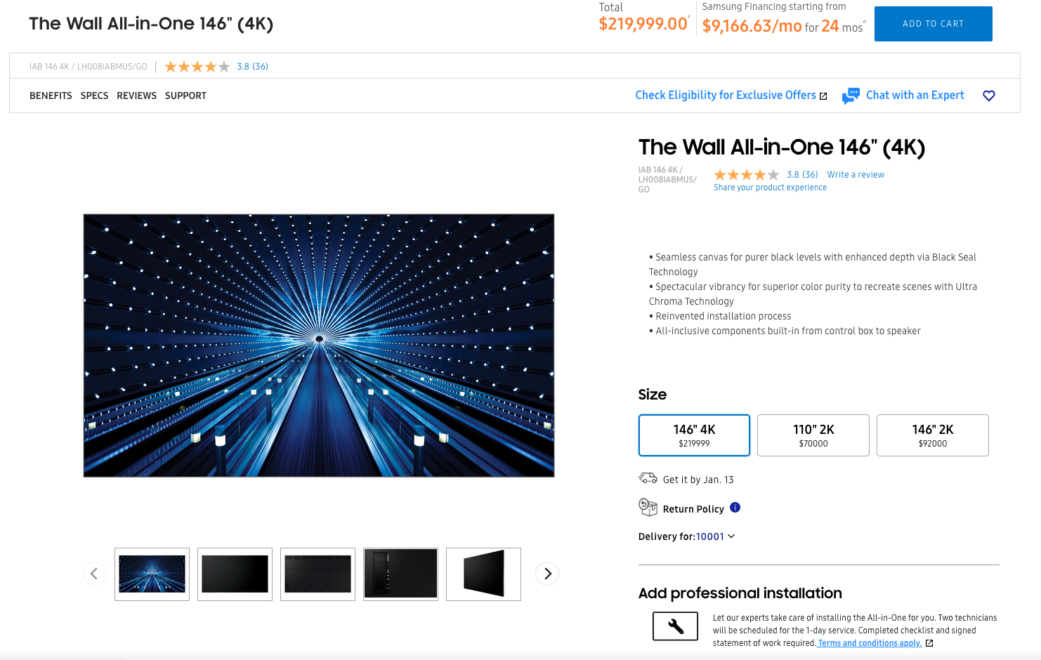
Source: https://www.samsung.com/us/displays/direct-view-led/ia-series/the-wall-all-in-one-146-p84-lh008iabmus-go/ (02. Jan. 2026)
The reason the production process is so complex is fairly simple. As we know, each pixel consists of three subpixels, so three Micro LEDs are required per pixel. For a 1920x1080 resolution, there are around 2.1 million pixels and 6.2 million subpixels total. Therefore, the display must consist of 6.2 million individual LEDs.
However, you cannot “print” these LEDs onto the screen as you can with OLEDs. Instead, the LEDs must be grown on a wafer, cut, and physically transferred onto the screen’s circuit board. This “mass transfer” process is currently extremely slow and error-prone. Each LED must work perfectly; even with 99.99% manufacturing accuracy, there would be over 600 dead pixels, which would be fatal for a commercial product.
For now, Micro LED panels remain the ideal of the perfect display. While they may become standard in the future, the technology is currently too expensive for affordable consumer displays.
Surface Treatment
Now that we understand the different types of panels, there is one final consideration regarding the monitor’s physical build: the surface treatment. This describes how the monitor handles the interaction between external light (or ambient reflections), and internal light (or the image emitted by the pixels).
There are two main categories: Glossy (smooth) and matte (anti-glare).
Glossy Surface
A glossy surface is typically a polished glass pane without a rough diffusion layer. This allows light from the pixels to pass through unhindered.
Without a diffusion layer to scatter the light, glossy screens produce vibrant colors, deep blacks, and the sharpest possible text and images.
However, the screen acts like a mirror. External light hits the panel and bounces off at the same angle, a phenomenon known as specular reflection. In a dark room, this is rarely an issue. In bright rooms or near windows, however, reflections can be highly distracting and cause eye strain.
Anti-Glare Surface Treatment (AG)
Most office and gaming monitors have an anti-glare surface treatment, also called matte. They have an outer layer that is roughened or textured at the microscopic level. This treatment is technically known as an anti-glare (AG) treatment.
When external light hits the surface, the rough texture diffuses the light rather than reflecting it directly back at the user. This transforms sharp reflections into a soft, diffuse haze.
While this eliminates the “mirror effect,” the rough surface also scatters some of the display’s emitted light. This can result in slightly reduced contrast, a “grainy” appearance on white backgrounds, and less vibrancy compared to glossy panels.
Note: There is a second, more premium method to achieve a matte finish. Manufacturers like Apple (who market it as “Nano-texture”) and some high-end drawing tablets use a chemical process to etch the glass panel itself at the nanometer level rather than applying a plastic film. This technique maintains the anti-glare benefits while preserving significantly more contrast and sharpness than standard matte coatings. The image below shows a comparison of a MacBook Pro 2021 with a standard display (left) and a MacBook Pro 2024 (right) with the nano-texture display.
Anti-Reflective Surface Treatment (AR)
Although AG and AR sound similar, it is important to distinguish between anti-glare (AG) and anti-reflective (AR), as they operate on different principles. AG (matte) deals with reflections by scattering light (mechanical diffusion). AR (glossy/hybrid) deals with reflections by canceling light through optical interference.
An AR coating uses multiple thin, transparent layers to create destructive interference. It essentially manipulates light waves so that a large portion of reflected light cancels itself out, allowing more light to pass through the surface rather than bounce back into your eyes. This technology is also used on camera lenses and eyeglasses.
AR coatings are typically found on high-end glossy monitors because they reduce glare without blurring the image, unlike matte coatings. However, due to the high manufacturing cost, it is usually reserved for premium consumer displays and specialized medical or color-grading equipment.
Anti-Fingerprint Surface Treatment (AF)
As the name suggests, an anti-fingerprint (oleophobic) coating reduces the visibility of fingerprints on a display. It alters the surface tension of the screen so oils from skin cannot easily stick to the glass, making residue easy to wipe away.
This treatment is standard on smartphones and touchscreen laptops but rare on desktop monitors because users typically do not physically interact with them.
4. Brightness, Contrast & HDR
We’ve discussed brightness and contrast quite a bit in relation to the different types of panels. Now, let’s clarify what these terms actually mean.
Brightness
The term brightness is pretty self-explanatory. It describes how intense the light emitted by the panel is. However, when we talk about brightness, we usually mean peak brightness, or the maximum brightness that the display can reach.
Brightness is measured in candelas per square meter (cd/m²), also known as nits. Generally, the higher the nits, the easier the screen is to read in a bright room. To provide context for interpreting the amount of nits a monitor has, we can roughly categorize them into the following ranges:
- Bad (less than 250 nits): This is essentially too dark for any room that has windows. So it’s best to avoid this range completely.
- Standard (300 - 350 nits): This range is perfectly fine for most indoor lighting but it might be too dark if you are working outside on a laptop.
- Good Tier (> 400 nits): Most modern laptops start here and are perfect for working indoors and also pretty good for working outdoors.
Contrast
Contrast is the difference between the brightest white and darkest black that a screen can display. It is usually expressed as a ratio, such as 1000:1. A ratio of 1000:1 means that the brightest white in an image is 1000 times brighter than the darkest black in the same picture. This is what we call static contrast. Most manufacturers also advertise dynamic contrast, which appears as a massive number, often millions to one. You can largely ignore this number. Dynamic contrast measures the difference between a fully white and a fully black screen over time, dimming the backlight in between. It tells you very little about how the monitor handles complex images with both bright and dark spots.
A good contrast ratio is crucial if you use Dark Mode heavily or watch movies with shadow-heavy scenes. The best contrast is achieved with an OLED screen because it turns off the light emission of individual pixels to produce true black colors. Mini-LED LCD screens also have a good contrast ratio. These LCD screens use local dimming zones to approach OLED levels, though they can suffer from “blooming,” or a halo effect, around bright text.
IPS (1000:1) is the industry standard for standard office work for a reason: it is consistent, reliable, and affordable. While high-contrast panels sound better on paper, they have drawbacks. VA panels (3000:1) often suffer from “smearing,” or blurring during scrolling. OLEDs are expensive and are at risk of burn-in from static office toolbars. For most people, a good IPS panel is the safest bet.
High Dynamic Range (HDR)
Now that we have covered the basics of brightness and contrast ratios, let’s explore one of the most significant advancements in display technology of the last decade: High Dynamic Range (HDR). To understand HDR, we first need to define “dynamic range.”
Dynamic range is simply the ratio of contrast between the brightest whites and the darkest blacks that an image can display. Consider how your eyes work in the real world. You can stand in a dark room and look out a window on a bright, sunny day. Your eyes can simultaneously perceive the details of the furniture in the dark room and the blue sky and clouds outside. Your eyes have a massive dynamic range.
Old monitors using SDR (standard dynamic range) cannot do this. They have a very narrow range. If you expose for the bright window, the room becomes pitch black. If you expose for the room, the window appears as a blown-out white blob.
HDR aims to mimic the human eye. It enables a monitor to display very bright highlights and very deep shadows at the same time, preserving the details in both. To do so, the monitor must boost the brightness of white pixels while simultaneously turning off dark pixels. To understand how a monitor does this, we need to grasp two main concepts: Metadata and light control.
Metadata
HDR adds a layer of data called metadata. Think of it as a set of precise instructions attached to the video signal. Rather than simply sending an image, the computer instructs the monitor on the exact brightness of each pixel.
This allows for specular highlights (tiny, incredibly bright details, such as sparks, stars, or reflections) that stand out.
Light Control
Understanding the instructions is one thing, but displaying them is another. This is where the physical technology of your screen comes into play. There are two ways to achieve the contrast HDR requires.
Local Dimming (For LCD/LED Monitors)
As we learned earlier, standard LCD panels cannot produce their own light. Instead, they rely on a large backlight that shines through them. In order to handle HDR, they require a technique called local dimming. This involves the monitor turning off the backlight zones behind the dark parts of the image and boosting the zones behind the bright parts. Since these zones are larger than pixels, “blooming” can sometimes occur, as we also discussed earlier.
Many low- to mid-range monitors use an edge-lit backlight, which does not support effective local dimming. However, they are often marketed as “HDR compatible.” This just means the monitor can accept and interpret the incoming HDR signal. It does not mean that it can display it properly.
The only backlights that allow for good-looking HDR on LCDs are Mini-LEDs and Full Array Local Dimming backlights, the latter of which are the predecessors to Mini-LEDs and work similarly. On these monitors, local dimming can be applied effectively. However, they still control the brightness of broader dimming zones rather than individual pixels.
Pixel-Level Dimming (For OLED Monitors)
The best HDR results are achieved with OLED panels. With OLED technology, the brightness level of each pixel can be precisely controlled, eliminating the need for larger dimming zones. This creates perfect contrast.
Wide Color Palette
Finally, HDR is not just about light; it’s also about color volume. HDR signals use a much wider color space, a topic we will cover later. The HDR protocol requires monitors to accept a 10-bit color depth. While standard RGB representation only requires 8-bits per color channel, 10-bits allow for significantly more color nuances to be displayed. However, keep in mind that a monitor only needs to accept this signal, not necessarily display all of those colors.
Certifications
Just because a monitor claims to support HDR doesn’t mean it can use it properly. Any monitor that claims to be “HDR10 compatible” can accept an HDR signal. However, if it lacks local dimming, the image will look washed out.
To avoid this “fake HDR,” look for the VESA DisplayHDR certification logo. Note that “HDR 600” and “DisplayHDR 600” are not synonymous. “HDR 600” means the display can achieve a high dynamic range with 600 nits of brightness. DisplayHDR 600, however, is a VESA certification that confirms the monitor can produce the desired results at this brightness.
The VESA DisplayHDR system rates monitors based on their actual performance. Some of the certifications are:
- DisplayHDR 400: This is the entry-level certification. While it is brighter than a standard laptop screen (400 nits), it usually lacks local dimming, which makes the HDR support effectively useless.
- DisplayHDR 600: This is the “sweet spot” for LCDs. It requires higher brightness and, crucially, some form of local dimming to improve contrast.
- DisplayHDR 1000/1400: These are the high-end tiers reserved for top-tier mini LED monitors that can reach extreme brightness levels for impactful highlights.
- DisplayHDR True Black: This certification is specific to OLED monitors. Since OLEDs can produce perfect blacks, they don’t need to reach the extreme brightness levels of LCDs to create a stunning HDR experience.
5. Colors
This topic covers how colors work in detail. This understanding is important if color accuracy is essential to your work, such as in graphic design or color grading. However, an in-depth understanding is probably unnecessary for the average user. However, since I found this topic interesting, I decided to explain it in more depth anyway.
To truly understand what you are looking at, you need to delve into the science of color. This guide breaks down the four pillars of monitor color performance: Color Spaces, Color Space Coverage, Accuracy (Delta E), and Bit Depth.
Color Spaces
A color space, also known as a color gamut, is essentially a specific palette of colors that a monitor can display. It defines the visible spectrum available to you.
Most monitors focus on three main standards:
- sRGB: This is the most common color space. Almost all internet content, games, and standard Windows applications are built around it. If a monitor cannot handle it well, colors will appear washed out or inaccurate.
- Adobe RGB: A wider color space designed for print photography. Printers can reproduce more shades of green and cyan than standard sRGB monitors.
- DCI-P3: It is wider than sRGB by about 25% and provides punchier, more saturated reds and greens. This is becoming the new standard for high-end “HDR” content and Apple devices.
In general, we can say: Adobe RGB is only relevant if you work primarily with print design. If you mainly work with web content, sRGB is sufficient. However, if you want brighter colors or work a lot with video editing, DCI-P3 is advisable.
Coverage
However, it’s important to note that not all monitors claiming “sRGB” or “DCI-P3” support are created equal. Color space coverage describes how much of a specific color space a monitor can physically display. Some common coverage levels are:
- sRGB:
- Bad ( 90%): The monitor lacks to support the full color range that is used by most applications and web content. This results in washed-out colors. This monitor should be avoided for any color-sensitive work.
- Good (95% - 100%): The monitor displays (almost) every color the web and most applications ask for. For most users, this is sufficient.
- DCI-P3:
- Standard sRGB (70% - 75%): This equals just 100% sRGB coverage and offers no additional benefits. Typically, monitors do not even advertise this P3 coverage.
- Good (90%): This is the sweet spot for premium gaming monitors and midrange creative displays. It offers good additional saturation without breaking the bank.
- Perfect (95% - 100%): It is found on high-end OLEDs and professional-grade monitors, such as Apple’s Retina displays and Dell’s UltraSharp PremierColor monitors. Due to technical limitations in backlight technology, it is very difficult to find 100% coverage in LCD monitors, but anything above 95% is perfectly fine.
- Adobe RGB:
- Average (~70%): Most standard monitors, even good gaming monitors, perform poorly in this area because they lack the deep cyans and greens necessary for printing.
- Good (90%+): A solid entry-level monitor for photographers.
- Excellent (99%): These monitors are only found in specialized, professional models (e.g., Eizo ColorEdge, BenQ SW series, and ASUS ProArt). These monitors are often expensive and thick because achieving these specific greens requires advanced backlighting.
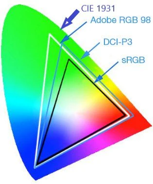
An important point to note is that color spaces do not necessarily build on each other, as illustrated in the image below. For example, even though the Adobe RGB color space covers more colors than the DCI-P3 color space, there are also colors in the DCI-P3 color space that are not part of the Adobe RGB color space.
Color Accuracy (ΔE)
In addition to the color coverage of certain color spaces, color accuracy is a crucial metric to consider.
Color accuracy is defined as the difference between the color received by the monitor as an input signal and the color displayed by the panel. This difference is measured using Delta E (often written as ΔE or dE).
Think of it as a single number that represents the “distance” between the color your computer requests and the color displayed by the monitor. It is interpreted as follows:
- : The difference between the input and output is so minimal that it is invisible to the human eye.
- : A trained eye might notice a slight difference when comparing two screens side-by-side, but on its own, it looks perfect. This is usually the standard to aim for if you work as a graphic designer or do a lot of color-sensitive work.
- : You usually won’t notice errors unless you’re looking for them. This level of accuracy is sufficient if you aren’t doing color-sensitive work, such as programming or gaming.
- : Color accuracy higher than 3.0 is generally noticeable. Things start to look off: Skin tones might appear sunburned, and a yellow banana might appear slightly green. In general, a value greater than 3.0 should be avoided.
One thing to mention is that you’ll often find monitors labeled as “Factory Calibrated with . This indicates that the monitor had a color accuracy of when it was produced, but this accuracy may degrade over time. This occurs because the backlight’s color temperature may shift over time, washing out the image. Another factor is screen uniformity. Typically, color accuracy is measured at the center of the screen. However, cheaper panels may have a slight color tint in the corners. Unfortunately, there is no easy way to determine the screen uniformity before buying a monitor (besides reading reviews and hoping that they address that). If this is critical for your work, you may need a colorimeter to measure it once you purchase the display. For most users, though, this is unnecessary, as poor screen uniformity is usually not noticeable as long as the color accuracy is good enough.
Color Depth (Bit Depth)
While the color space determines the range of colors a monitor can display, color depth determines how many unique shades of those colors it can produce. Essentially, it tells you how smooth the transitions between colors will be.
Color depth is measured in bits. The higher the number, the more color steps are available between “pure black” and “pure white” (or “pure red,” “pure green,” and “pure blue”). For example, an 8-bit monitor, which is standard for most monitors today, has 256 shades for each color channel (red, green, and blue), resulting in about 16.7 million colors total. For most use cases, this is perfectly fine.
However, for monitors that allow for “true” HDR, 8-bit depth is insufficient. Those monitors often have 10-bit depth, meaning each color channel has 1,024 shades, resulting in over one billion colors total. This is also crucial for professional color grading or graphics design, besides HDR.
Frame Rate Control (FRC)
There is one marketing trick to be aware of. Many monitors that claim to be “10-bit” are actually 8-bit with FRC (frame rate control).
This means the panel is physically 8-bit, but it rapidly flickers between two colors to trick your eye into seeing the “missing” shade in between. For instance, to display a particular shade of gray that it cannot natively produce, it may rapidly alternate between darker and lighter grays, blending them together.
This trick is common in HDR gaming monitors. In most cases, it is indistinguishable from a true 10-bit monitor, except to highly skilled professionals. Therefore, for most users, an 8-bit + FRC panel that claims to be 10-bit is perfectly fine.
Color Banding
If the color depth is too low, you encounter color banding. This happens when the monitor doesn’t have enough shades to display a smooth gradient (like a sunset or a blue sky). Instead of a smooth fade, you’ll see those stripes or “steps” of color.
Color banding is only an issue with 8-bit depth, and even then, it’s usually fine. With 10-bit panels, you’ve got a ton of shades to choose from, so this issue is basically non-existent.
6. Conclusion
To wrap things up, I’ll give you a quick summary of the main points here. This list should help you when you’re buying a new monitor. If you want more details on why I make each recommendation, just check the specific chapters.
The Basics
- Size: 27-inch is ideal for most desks. Only choose 32-inch if you sit further back or need massive screen real estate.
- Resolution:
- QHD: The perfect balance for 27-inch Windows/Linux gaming and office work.
- 4K: Essential for macOS users (to avoid scaling blur) and great for 32” monitors or media consumption.
- Refresh Rate: 60 Hz is fine for work, 120 Hz is way smoother but also more expensive (if it fits your budget, go for it, otherwise that might be the first trade-off to take). For gaming, go for at least 144 Hz.
Panels
- TN: Only for extreme budget builds or ultra-competitive eSports where speed > beauty.
- VA: Best for movies and dark rooms due to decent contrast (3000:1), but viewing angles are narrow. Often found on curved monitors.
- IPS: Great colors and viewing angles. Look for “IPS Black” panels for better contrast (2000:1) without the VA downsides.
- OLED: The ultimate picture quality (infinite contrast). Best for gaming/media. Warning: Risk of “burn-in” if used for heavy office work with static toolbars, even though most modern OLED screen do a good job preventing this using pixel shifts and other tricks.
- Micro LED: Choose this if you are rich as hell and want the best possible viewing experience. But unless you have multiple millions in your bank account, really don’t. Also, there are maybe a few devices that actually have a Micro LED panel, but this might be the best option in the future.
Brightness
- 250 nits: Avoid. Too dim for even moderately lit rooms.
- 300 - 350 nits: The standard. Good for typical home offices.
- 400 nits: Recommended for bright rooms with windows.
Contrast
- 1000:1 (Standard IPS): Greys can look washed out in dark rooms. Fine for office/daytime use.
- 2000:1 - 3000:1 (IPS Black / VA): deeply improved blacks; much better for movies.
- Infinite (OLED): Perfect blacks. Pixels turn off completely.
HDR
- HDR10: Basically no real HDR available, just says that the monitor can interpret the HDR signal, but doesn’t confirm that it can physically display it.
- DisplayHDR 400: “Fake HDR.” Often looks worse than SDR. Do not pay extra for this.
- DisplayHDR 600: The minimum entry point for a noticeable HDR experience.
- DisplayHDR 1000 / True Black: The real deal, but also expensive.
Colors
- Gamers / Office Users: 95%+ sRGB is perfectly fine. Don’t overpay for pro specs that you won’t need.
- Web Devs: 100% sRGB is mandatory, >90% DCI-P3 coverage is cool if it fits your budget.
- Print / Photo Pros: Look for >90% Adobe RGB and 10-bit color support.
- Video Editors: Look for >90% DCI-P3 coverage.
7. Final Words
This topic took me quite some time to write and research. Therefore, mistakes are possible, especially as I am not an expert myself and simply accumulated all information I found to my best knowledge. If you found any mistakes or have further questions, feel free to send an email to [email protected] and I’ll respond as soon as possible.
Thank you for reading through this post!